
Kelli Anderson is a painter, illustrator, photographer, letterpress operator, art history scholar, and a graphic designer; a proper polymath for the 21st Century. But more recently, the New Orleans native has been cutting her teeth as a guerrilla visual communicator.
Working out of her Williamsburg loft and studio with her boyfriend, Daniel Dunnam (who also hosts the bi-weekly music podcast, The Sounds in My Head), you might recognize some of her handiwork in the aesthetic marketing of the Yes Men, whose ingenious social and political activism is effectively aided by their use of print and interactive propaganda. Both Anderson and Dunnam have worked on supplementing the Yes Men’s message with visually compelling materials. Her take on the Dr. Zizmor ads that have adorned New York subway trains, was a particular highlight in last year’s on-target Yes Men satirical spoof of the New York Times, which she and Dunnam helped design.
Anderson is as engaging in her own words as she is in her work. Brooklyn The Borough was fortunate enough to catch up with her, to find out more about her background, her vast and varied body of work, and how she ended up a diabolical creative mastermind in Brooklyn.
Brooklyn The Borough: How did you become involved with the Yes Men?
Kelli Anderson: My boyfriend, Daniel, and I saw the first Yes Men movie together (watch a preview for their latest movie here) and it knocked our socks off. Being the more outgoing of the two, he contacted them to see if they needed any help with future projects. They did! Working as part of the Yes Men group has been an amazing experience.
Daniel and I get brought into the projects which necessitate some degree of delicately-calibrated visuals. So the New York Times and New York Post projects were perfect for our involvement, we could really shine there — obsessing over typefaces, crafting fantasy advertisements from the post-corporate utopian future, dealing with printers, etc. Although we attended some initial conceptual meetings, the writers worked on the respective papers for months before the project moved (quite literally) over into our apartment. I basically had carte blanche with the ads — Daniel worked primarily on the layout of the paper, but we both tinkered. And of course, it is very fulfilling to work on projects that are this interactive. We could get both solicited and unsolicited feedback immediately during distribution. It has all been pretty magical thus far– it spite of being a ton of work with an uncertain outcome/reception. There were moments at 5am when there was real worry in the room, but both paper projects turned out really well.
BTB: How much of a factor has social satire been in your body of work?
Also, satire can successfully pierce into difficult and/or complex subjects where other approaches won’t work. It can isolate qualities in a social system (like advertising) that would be difficult to discuss verbally. For example, with the “ads” in the special edition New York Times and New York Post, I really wanted to distill the utter strangeness of this alternate consumer reality — to put that weirdness in a bottle and really study it! The Dr. Zizmor ad is perhaps the most successful example of this. Strange ads are a great inspiration and a great source of unintentional comedy that it simultaneously very illuminating. For example, next time that you are bored, search YouTube “Franky and Johnny’s Special Man” which is a truly bizarre TV commercial from 1980’s New Orleans — it clarifies so many things about consumer culture. Its these discarded and uncomfortable bits of overlooked (ignored?) culture that really get to the heart of things quickly – like a window to the social id.
BTB: You garnered some attention for your Masters thesis, “Designing for Deep Time.” What was the gist of that? The power of visual symbols, social media…?
KA: Yes, my art history master’s thesis was about nuclear waste marker design. There is a unique problem with marking nuclear waste because it remains highly toxic to life for at least 10,000 years. This means that danger posed by the waste that we create today will outlast the ‘quarantining capabilities’ of the Department of Energy, the United States, and possibly mankind. Languages actually deteriorate quite rapidly (read Beowulf lately?). Images lose their meaning. Oral traditions stop being told. It is an awful ethical quagmire. In 1983, the U.S. Nuclear Regulatory Commission decided that the solution must (at least) transcend language — and that a permanent, physical solution be built as a marker/warning system.
To comply, the U.S. Government assembled a team of architects, artists, historians, “futurists,” and a token science fiction writer to design for an unknowable audience 10,000 years into the future. Convening in November 1991, these experts were divided up into a “Futures” panel and a “Markers” panel — which developed physical structures/spaces to deter entry into the site.
For my thesis, I studied the team’s fascinating “designs of revulsion” sketches and interviewed participants to see how the unorthodox design objective was broached. Their conclusions and design sketches are fascinating and draw heavily upon the history of non-verbal communication in art and design. Some objects from the history of art communicate readily and others are completely opaque. They tried to identify trends in terms of why we can understand some objects and not others. They developed a multi-level plan for the DOE which involved physical markers, pictograms, sounds, and oral tradition — all of which were never implemented. You can read it online here.
BTB: What are some of your future plans? Anything coming up for the Yes Men that you can tease us with?
KA: The concept-to-finished timeframe for the Yes Men projects is generally pretty fast. As soon as anyone knows what is going on, it is already getting done.
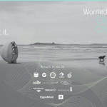
An upcoming project-to-facilitate-a-project might be worth mentioning: I will be using Kickstarter, which is this alternate funding mechanism for interesting projects that have no readymade economic model for their support (like art projects, for example.) You basically post your project description and offer tangible rewards to people who support your project financially (like applying for a grant where the entire internet is the grant committee, and they have been bribed with goodies.) Anyway, my proposed project uses photography to reveal long-term changes in the landscape. I’ve been developing a process for making very long (multi-day) exposures during daylight hours. The long-exposure photographic technique unfixes the image in time, showing off all movement and activity ordinarily hidden from the human eye (the path of the sun, atmospheric aberrations, etc.) My ambition is to photograph the volcanic Icelandic landscape in this manner — since the ground there reveals the methods of its creation through its geologic eccentricities. Essentially, this project would consider the inadequacies of human perception of time — using the camera to reveal aspects of the landscape that are normally hidden. I did a test with some crap plastic cameras a few months ago when we were in Iceland for a wedding. This set-up was left in the wild for three days and yielded this exposure. The grant would enable me to go back with some real cameras to capture actual detail. I like the idea of photographic catch-and-release.
Another project in the works is a collaboration with a friend (although we haven’t figured out where and how to pull it off yet) so it continues to grow conceptually. We want to find a non-art space in which to stage a “clinic-as-art-project.” The purpose of the clinic is to solve people’s existential crises through obsolete technology and simple math. It will be ridiculous, deadpan, and very engaging. It is based on the simple matrix of listing possible life activities, abstract values/goals, and then rating how much those activities correlate with the values/goals. The installation will be composed of obvious clinical and mechanical legerdemain — there will be unnecessary beeps, paperwork, giant computers, etc. Our promotional site is here to get people interested. I think this would also work as an online application for facebook or as a stand alone website.









Be First to Comment